Design Makeathon Challenge April 2023
iSucceed
Conducted research and created a high-fidelity prototype of a website to help students, within the College of Information Science, optimize networking, career, and advising resources within a 24-hour time period
Problem

Undergraduate and graduate students in the iSchool face information overload and difficulty locating resources on the website, making it difficult to network with others, find career opportunities, and make advising appointments.
Solution
We developed a webpage database for iSchool students that will act as a supplementary resource to the iSchool website.
We decided on a web page since users stated they access iSchool-related information via desktop devices. We also realized having a mobile device could be cluttered, make the information harder to see, and make it so information is only available if the app is downloaded.
Overall: 24 hours
Discovery & Research: 6 hours
Design & Testing:
12 hours
Timeline
Tools
Adobe Illustrator
Google Surveys
FigJam
Figma
Roshida Herelle
Anjali Verma
My Role
UX Researcher
UX Designer
Team

My Design Process
Generative Research
User Interviews + Surveys
Low-Mid Fidelity Prototypes
Analysis
Figma Prototype
Next Steps
Generative Research
We wanted to understand what current students in the iSchool thought about the existing iSchool system, so we looked on Reddit because students use it for the following reasons:
Find out courses that could prepare them for a career
Guidance on how to achieve their goals
Find people within the iSchool to connect with

Competitive Analysis
Through competitive analysis, we found that some colleges within UMD…
Have an advising portal that makes setting appointments easier
Guidance on how to achieve their goals through professional networking opportunities
help students find opportunities to connect with each other

Interviews
During the ideation phase of the project, we conducted in-person interviews with two graduate students and one undergraduate student. I also created a Google Form Survey that four undergraduate students, within the College of Information Science, answered. This was used to help the creation of user personas and to inform the design. Together with the team, we prepared an interview script with 17 open-ended questions, focusing on our target audience’s concerns about resource access and how they go about finding career/ networking opportunities. I interviewed one student, took notes for the second, and observed the final. We referenced the user interview findings throughout the entire design process.
Main Issues Based on Survey + Generative Research:
All students view iSchool materials on a desktop/computer
75% of students connect with other students in their classes
25% of students use InfoSci group chats to ask major-related questions
Some found the iSchool website confusing due to information overload
Main Issues Based on Interviews:
2 graduate students rely on word of mouth, info from their cohorts, emails, and newsletters for opportunities, events, and courses
1 graduate found the website overwhelming when finding resources
The undergraduate student, a double major, had trouble navigating the website for specific course info and relied on drop-in advising. They preferred a more accessible page and scheduled advising.
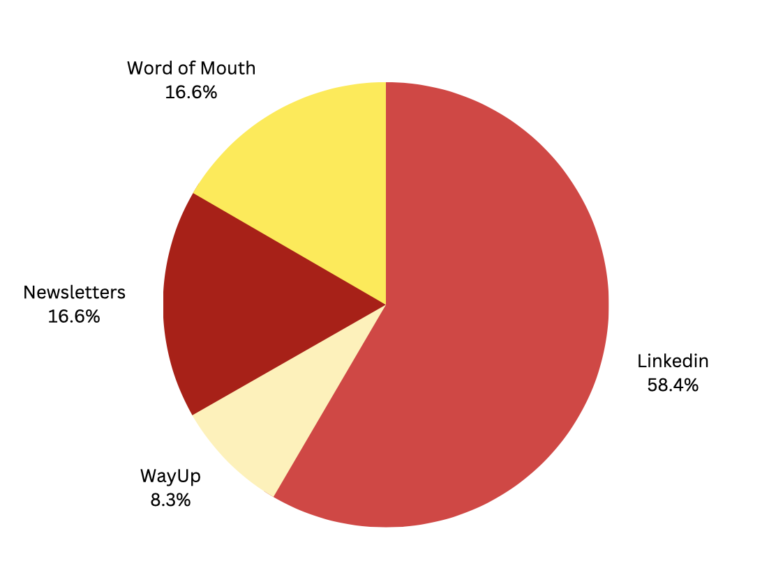
When asked how they find job opportunities, 3 undergrad students reported they use Linkedin while 1 undergrad student reported they use Linkedin and WayUp.
3 live interviews: 1 person said they use LinkedIn, while the other 2 use LinkedIn, newsletters, and word of mouth.
Analysis - Affinity Mapping
Patterns in the User Interview Data:
Connecting the dots.
iSchool website is overwhelming, which makes it difficult to find things
Students use LinkedIn, Google search, and word of mouth for career opportunities and networking
Students do not feel supported by the department when it comes to finding job opportunities and career resources
Undergrad students wish there was a better way to schedule meetings with advisors, stay updated on their degree progress, and know what classes they need to take.
Graduate students enjoyed the ease of scheduling their advising appointments through the convenient platform provided on the website.

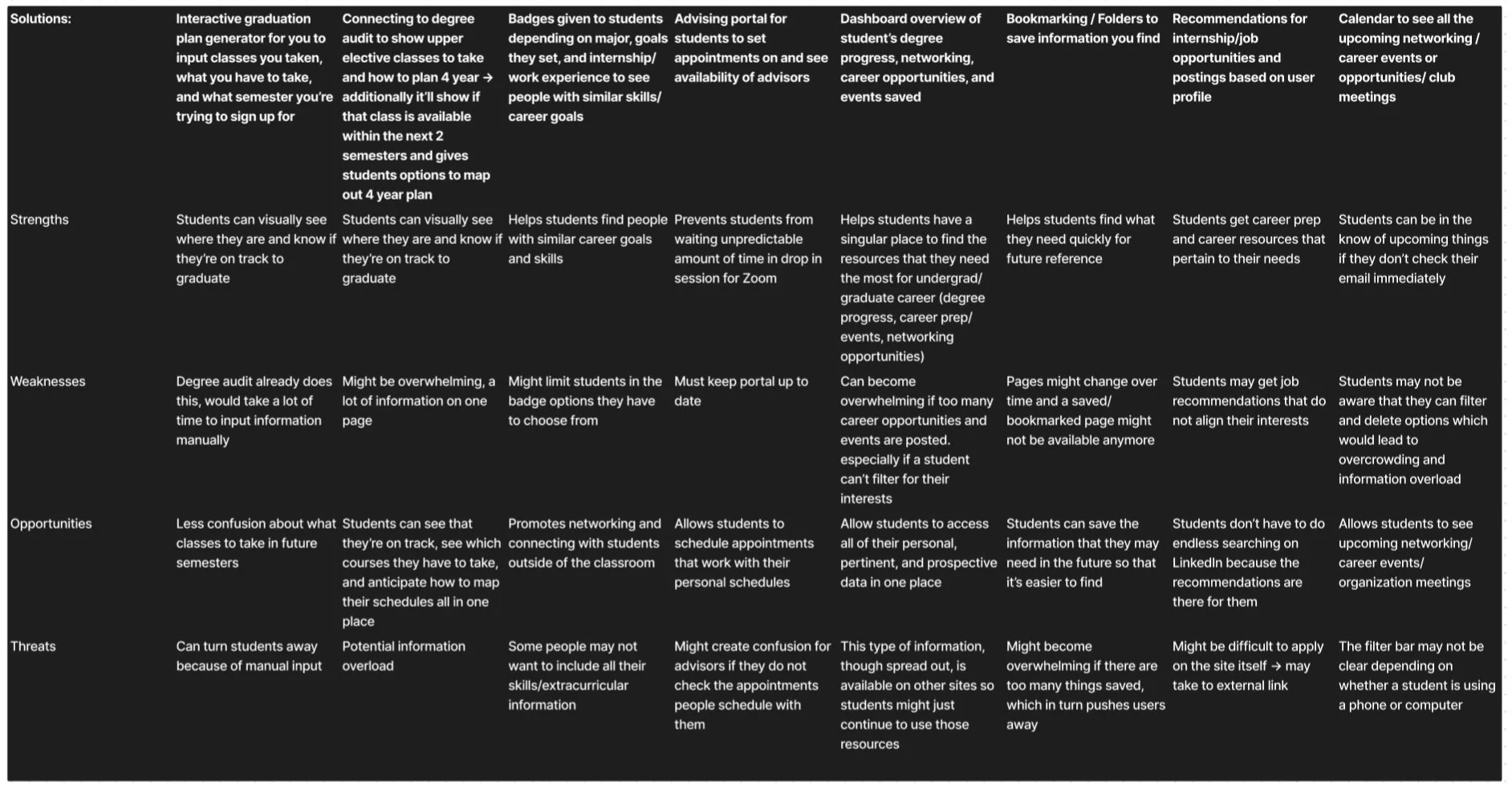
SWOT Analysis
User Personas
-
![]()
Undergraduate User Persona
-
![]()
Graduate User Persona


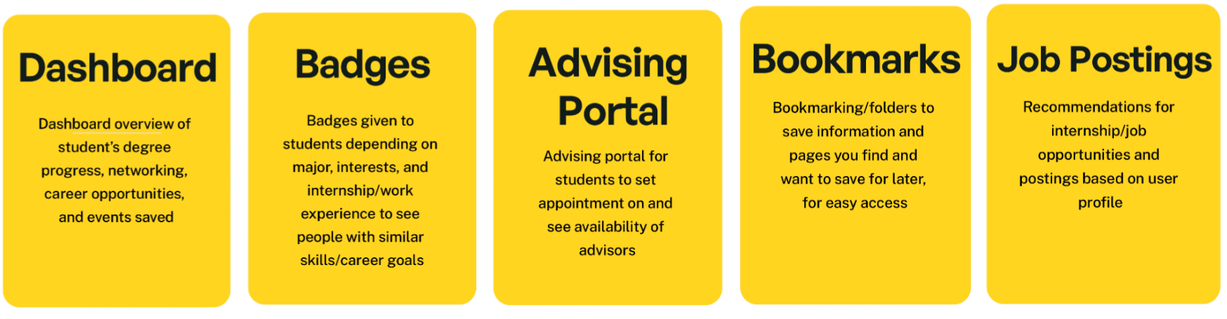
Our Key Features
StoryBoarding
We created a storyboard to show how iSucceed could alleviate Ethan's pain points.

Site Map

Low-fidelity Wireframes

Mid-fidelity Wireframes

Branding
We created a logo for the webpage and made sure to tie it back to UMD by using their colors
We wanted to make sure our tone was inviting but also representative of the iSchool by relaying information in a concise way.

Badges and Iconography
We created badges for users to create a fun incentive for using iSucceed
Badges are acquired by doing things like completing the profile and adding skills.
We used an icon pack to make sure there was consistent branding throughout

Figma Prototype
Our goals for this prototype:
Provide a place where students can easily make an appointment with their advisors
Help students with like-minded goals connect with one another
Give students easy and quick access to networking and career resources

Usability Testing
We had two users test our prototype
The user looked for pre-skills career prep on the career page instead of resources.
We can rethink our information architecture
The calendar color made it hard to see the dates so we changed the color to make it easier to see
Both users thought our interface was intuitive and well-organized.
Both users appreciated the ability to connect with other students.

We tested how fast users could locate the pre-skills preparation document on the iSchools original website and then on our supplementary one
Next Steps
Due to the nature of this 24-hour challenge, with more time, we would have fully fledged out the prototyping for the graduate student portal.
01
More User Testing
We want to conduct further user testing to understand better how we can improve our user's experiences and to ensure our solution is successful.
02
Expand Courses Page + More Buttons
With more time, we would develop the courses page, giving customizable options to structure schedules. We also wish to add more interactivity through added buttons.
Explore Feasibility and Backend
03
We plan to take more time to consider practicality and hope to develop the backend of our webpage dashboard.
Learnings
We learned how to collaborate on a project, walking through the entire UI/UX process in a short amount of time. We each played to our strengths and taught each other a lot about Figma and Adobe Illustrator.
Thank You!
Please check out my other Projects!